Whenever you see an amazing campaign bursting out of nowhere, it’s always amazing to wonder how that brand got their data. Who did they ask to get that story? Are they part of a secret club where this information is widely shared? Is there some resource they are keeping to themselves?
Probably not.
Data journalism isn’t anything new, indeed reporters and journalists have been seeking out quirky stories for years, but it’s now brands that are telling their stories. Whether it’s something connected to their brands or not.
So what are data campaigns?
Simply put, data journalism takes an unusual finding and weaves a story around it and it can form a really valuable addition to your marketing strategy. The magical three elements that data journalists look for is that a story or set of data is:
- Likeable
- Shareable
- Relatable
All these boxes have to be ticked in order for it to work, but we’ve seen tons of campaigns fly from the most unexpected corners. Some of the most eye-catching campaigns can come from a simple observation or simply using search engines to find inspiration for a piece of content.
For example, ever wondered out loud how many red cars there are in the world? Or perhaps pondered that famous Ivy League admission question, ‘How many windows are there in New York’? Well some people try to find those out and it’s a great way of making a splash, particularly if you can identify pain points for potential customers.
Here’s a few more examples of real campaigns we’ve seen work:
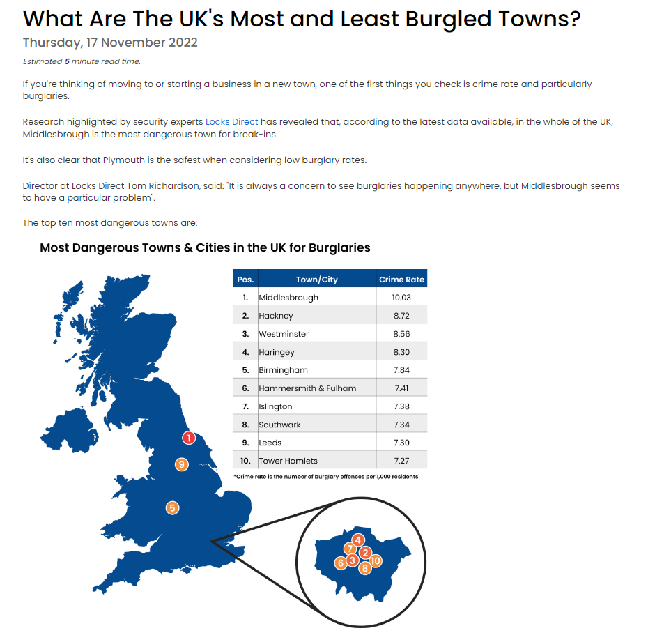
What Are The UK’s Most and Least Burgled Towns? – Locks Direct
This is one we did ourselves. By linking security experts Locks Direct with a rundown of the most and least burgled cities we found from a combination of published crime stats and the aggregation site Crimerate, we were able to break down cities, council areas and more. We also replicated it locally for a city, breaking down the areas in that city to show the same. This was a simple data mining story that came from effectively a single, factual source.
Cities Where Residents Have the Worst Commutes – 2023 Edition – SmartAsset
Interpreting data is half the battle for campaigns. This campaign from financial advisory platform SmartAsset shows the worst US cities for commute times. This was measured against several metrics, all taken from public data found in a census survey. This means that the data is not simply one strand, it’s several that can be compared and made into an arbitrary score and presented together as a cohesive whole.
The World’s Most AI-Driven Cities – Business Name Generator
This campaign takes its sources from around nine different portals. It shows in a succinct, easy to understand way which cities around the world are leading the charge in incorporating artificial intelligence into their education, careers, and different ventures. The metrics used for scoring or presenting this include how many AI jobs are available there.
But where do you get data from?
That’s a great question, but one that can be easily answered. Data can come from many different sources, but the most valuable is the data you own yourself. Your business niche will have access to a great many numbers, trends and facts that you and you alone have access to. Combining this with a way of presenting it and taking advantage of it is a perfect opportunity that may well be staring you in the face.
For example,own a key cutting business? Then track the anonymous data that you can, is it mainly houses or flats that need new keys?
Is there a trend in areas as to who needs replacements the most? Are there patterns that you notice during the day to day running of things?
Spot something interesting and you can create data, infographics and draw conclusions that can create the backbone of a story that may well be of real interest to everyone.
No data or trends that you’ve noticed within your niche? If you’ve really looked and can’t find anything, then look elsewhere. Data from YouGov or other government studies, surveys or projects is freely available and often just needs some research time to extract what you need.
The important thing to remember with data is that you can interpret it the way you want. For example, a plain looking stat that simply tracks the number of times someone has done something or that simply logs a frequency of an event or instance of something happening can seem quite plain, but with intent and research, can become something amazing.
Take a relatively common business like a chain of hairdressers, if booking forms have fields such as age or location, this means you can not only use this for market research, but also for trends.
Do a certain age demographic have their hair cut or styled more regularly for example? Is there an emerging trend for certain colours at certain times of the year?
How often do they visit? When do they visit? Is there correlation between the data and something you can apply that makes sense and is interesting, perhaps you can build more out of what looks like humdrum and banal data than you first thought.
How do I present it?
In today’s digital world, presenting data in an attractive way is essential for Digital PR campaigns. The right data presentation can help to grab the attention of your target audience, and make your campaign stand out from the crowd.
Here are some tips for presenting data in an attractive way for use in Digital PR campaigns:
Choose the right visual format: There are many different visual formats that you can use to present your data, including info-graphics, pie charts, graphs, and maps. Choose the format that will best showcase your data and make it easy for your audience to understand. For example, if you have data that shows a trend over time, a line chart might be the best choice.
Keep it simple: While it may be tempting to include all the data you have collected, try to keep your presentation as simple as possible. Focus on the key points that you want to convey and use visuals that are easy to read and understand. Avoid clutter and unnecessary information that can distract from your main message.
Use colours and icons: Colours and icons can help to make your presentation more attractive and engaging. Use colours that complement your brand and make your data pop. Icons can also be used to represent data points and make it easier for your audience to understand.
Tell a story: Data can be dry and boring, but it doesn’t have to be. Use your data to tell a story that will resonate with your audience. Start with a hook that grabs their attention and then use your data to support your main message.
Make it shareable: When creating your data presentation, make sure that it is easy to share on social media and other platforms. Include social media buttons and encourage your audience to share your data with their followers. This can help to increase the reach of your campaign and generate more interest in your brand.
Make it interactive: Interactive data presentations can be more engaging and memorable than static ones. Use tools like sliders, hover effects, and animations to make your data come alive. This can help to keep your audience engaged and interested in your campaign.
Presenting data in an attractive way is key to the success of any Digital PR campaign. By choosing the right visual format, keeping it simple, using colours and icons, telling a story, making it shareable, and making it interactive, you can create a data presentation that will grab the attention of your target audience and make your campaign stand out from the crowd.
Still need some inspiration? Email me on mike@ecomone.com.
